
Black and White #3 with Grisaille
I struggled slightly with perspective in this one, because I simplified the background and had to fill in places that I couldn’t directly observe because I removed objects from the background. It was also a rainy day, and the paint dried much more slowly than it had previously, which was at first helpful and then frustrating as it reached the “bitchy stage” and stayed there longer. My struggle with perspective made this slightly more challenging, and also interpreting bright colors into values was more challenging that just painting black and white to black and white. I feel that I was successful because I conquered these issues. I found white, yellow, less saturated tones of blue, green tones, and orange to be the lighter values and red, purple and more saturated tones of blue to be darker in value. I feel even more strongly that I want to be more gestural, because I think that all my paintings of still life’s in this class and my drawings of them in my drawing II class are very similar and I feel like its time to mix it up. I was drawn to Christine’s painting, which had simple and strong gestural lines that appeared to effortlessly express the subject matter with far less work than what I did.
When adding the Grisaille, I found it very fun. I loved being able to focus on color because the values were already in place. I did have to let go of trying to make the colors as bright as the still life was, but I like the overall feel of the result better than the bright solid colors were anyway. I will definitely be using the technique in the future.

Grisaille Painting
This painting further showed me how much I like this method. It is much easier to find all the values in black and white, and I really enjoy adding the colors later. It felt so much easier and more efficient than trying to paint the colors from the beginning. I do know that I need to practice this much more to make it cleaner. I was impressed with the outcome of many of my classmates pictures. The depth and richness of this method is very appealing to me and I think a lot of people had great success with it.

Black and White #1
I understand and appreciate the assignment, and it was interesting to think of painting similarly to how I think of doing a charcoal drawing. I found acrylic to have the usual limitations I find frustrating and that I hope to overcome this semester. I prefer a color based greyscale, and find the black and white grey flat and inaccurate to the grey I observe. I experimented with glazing and I think that there is potential for me to like acrylic more by doing more glazing and other more interesting techniques. I found Cory’s painting, though less clearly rendered, more interesting to look at than mine. He made it feel restful and the gestures were pleasing. I think I should try and loosen up my technique and see what happens. I strove for observational accuracy, but found that the paintings that had a full range of value got better feedback than my painting did, even thought there was no black in the still life.I think that I should try to be more expressive, looser with my gestures and push the value range even when that is not what I see

Impasto
I abandoned all restraint on this one, starting out with messy brushwork, adding iridescent structure gel with my fingers, and then continuing to use my fingers and pallet knife to add the layers of plants, pots, fence and shadows. I am usually a pretty thin and careful painter so it was fun to blob it on, and the painting was surprisingly successful considering how haphazard I felt doing it. I follow some very amazing impasto painters on Instagram and I wish I knew how they achieved such glowing three dimensions, so this was a fun experiment. I liked Lance’s impasto painting, the structure worked very well under the paint.


Abstract #2
I really had fun with this one, setting it up in my back yard area and allowing myself to be as messy as I wanted. I combined the artists Morris Louis and Adolf Gotlieb. I admire the simplicity of Gotlieb, and I absolutely love pouring paint and watching it mix and blossom and think its fantastic that Louis made a career out of that. I have also been dreaming about staining raw canvas since I painted a Rothko attempt a few years ago. I really want to paint on the large scale that these two paint on one day. I poured and mixed paint, mixing it with water in cups first and pouring, and later using a large brush to put more on the canvas. Though the process was really fun and rewarding, the outcome is not as impactful as I was hoping for. I am ok with that however because I enjoyed the process and will be experimenting further with this in the future as I feel I have a lot more questions to be worked out about it.

Colorful Pre Assessment
I was excited to work with colors, but found myself over thinking them as I struggled to find a section of the still life with colors that I liked. Finally I chose subject matter that interested me, and had a good battle with the subject matter to get it to do what I wanted. I was more gestural, and included many layers of color and glazes. Blue had strong tinting strength when mixing colors. I really enjoyed experimenting with the reflections in the pink vessel. I found the temptation to tweak the colors according to my interest somewhat irresistible, and as a result the skull is not the same drab green color as it was in real life. I found my attempts to be more loose in my brush handling results in me also being more loose in my observation. I am not sure if that is a good thing or something that needs to be reined in, in the case of this class. I wanted to skull to look like it was glowing, and added a halo around the top of it that did not exist in real life. In the critique I was drawn to the flat colors of Sarah’s painting. I am impressed with how flat and solid the colors were, and I’m not sure I could paint that way even if I tried. I am the most looking forward to being forced to see and paint colors differently than I am used to in this class.

Black and White #2
In this painting I tried to push the values, be more gestural, and I experimented further with glazing. I found that doing multiple glazed passes over the shadows added richness, depth and realism. I am happier with this painting now than I was when I first finished it, because then all I could see what my struggle where now, after some time, I am able to see it as a whole. I would like to be able to better hide my brush strokes. I blocked in the forms first, then blocked in the shadows, identifying similar values, and then brought the whole painting down to the correct value at once, focusing on shadows and forms and not the outline of the object. I think it is the attention to the values over the objects that gives it an appearance of being there dimensional. However my brush strokes are distracting and more layers of glazing probably would have been beneficial.

Depth Challenge
It was very interesting to me to attempt a completely different style and approach than I normally would. Everything including not focusing on the linear perspective, mundane subject matter, and sketching out my ideas so completely ahead of time was a different experience for me. I enjoyed it but it felt a little insincere for some reason and I am not particularly pleased with the outcome. It feels forced and cartoonish and like I allowed to many of my old hangups into the picture, like I might do if it were a drawing in a sketchbook. I really like the addition of gold leaf by one of my classmates, as well as Lance’s lovely sky.
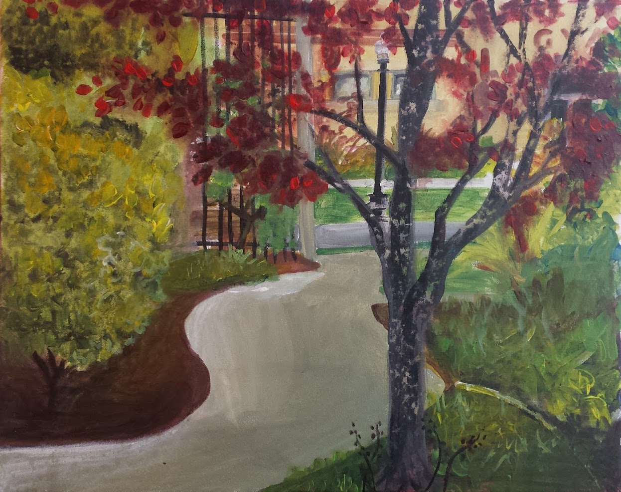
Plein Air
The worst part of painting outside was trying to get my painting area set up. I brought way more stuff out than I needed, and ended up painting flat on the ground instead of using the easel. The best part was the breeze, the way the light looks for real, feeling the grass under my feet, and knowing that I had limited time. Knowing I had limited time helped me to not stress or overthink things and just go for it. My absolute favorite part was getting rained on at the end and the rain naturally creating the texture in tree. Next time I paint outdoors I will not bring so much with me and will be more organized. I also will get closer to subjects and try and find a more interesting subject matter. I think my attempt at non linear depth was successful. I think the gymnasium peeking through the trees is the most interesting part of the painting. The shape of the walkway proved to be a challenge but I think that I got it to work in the end. Lance’s painting of the fountain was very beautiful, especially the sky.

Abstract #1
Starting from the image cut from a magazine, I blocked in the off white and shades of dusty blue. It was the simplicity of the colors and the calmness of the photo that finally drew me to choose that one. Once the background was blocked in, I let it dry and then stopped thinking. I just went with whatever felt right, the drips and dashes happening naturally as well as the addition of the reds and yellows. I think it is interesting how it came out, but I would like to explore painting like this more often. I find it challenging and much more difficult to get a result I am happy with than I expected.

Gray and Brown Painting
I really enjoyed this one, as I went for it with hardly any thought and loose brush strokes. For a while I fought the nagging feeling that I was just making a mess of things and it wasn’t even going to be intelligible what I was looking at by the end, but luckily it came together after some time and some welcome pointers from Gioia. She suggested the blue reflected light in the back of the chair, and I feel that the addition of that and the shadow from the back of the chair to the support beneath it are the most successful parts of this painting. It felt good to block in the skull extremely roughly and then go back and add details as needed without over working every nuance. I continued to experiment with glazing and felt good about it. The brush strokes in the background color continue to bother me but I feel accepting. I liked Cory’s painting for this project because of the drama of the shadows he caught in a sketchy impressionist style. I prefer this to black and white because no grey is really as flat as black and white paint mixed. I am feeling more comfortable with the way the paint works and the speed at which it dries. I still don't like how opaque and plastic it looks when dry, but the glazing is helping with that.